

Burndown Charts

The burndown is a chart that shows how quickly you and your team are burning through your customer's user stories. It shows the total effort against the amount of work we deliver each iteration. Something like this:

We can see the total effort on the left, our team velocity on the right. But look what else this simple graphs gives us.
- Work done each iteration
- Work remaining
- Work done so far
- When we can expect to be done
All this from one graph!
Now what you see above is pretty ideal. A more realistic burndown looks something more like this:
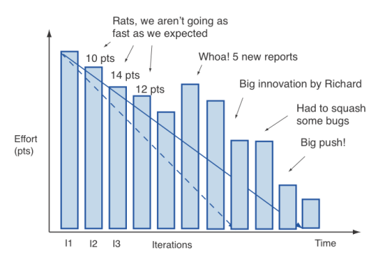
It’s never a straight line. The team never moves at exactly one fixed velocity. And we discover things along the way (notice how it shows us scope creep in the form of those 5 new reports).
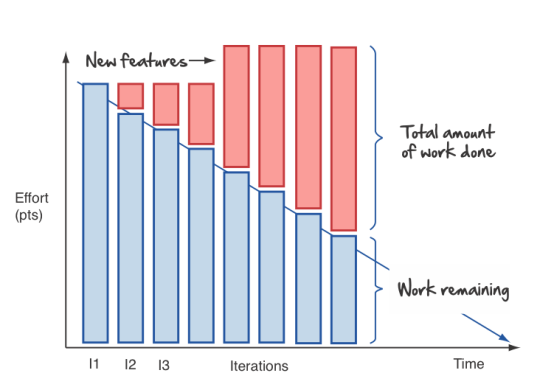
And of course like all things in Agile, you are free to make things your own. One tweak I like making to the burndown is displaying total work done each iteration also. This let’s me look at the chart, and immediately get a sense of whether we are a quarter, a third, or ½ way done the project.
- Make the reality of the project clear.
- Show the impact of decisions.
- Warn you early if things aren't going according to plan.
- Get rid of all the wishful thinking around dates.
If you are looking for some burndown charts to get you started, here are the ones I use:
You can also watch a short video on burndowns in our episodes section here.